“Every county reports its coronavirus stats, but useful knowledge can be gained by holding up the numbers against other counties and normalizing by population size, which is what we have done,” says Vladimir Minin, a professor of statistics who led the team responsible for designing and developing UCI’s new COVID-19 statistical trends website. Courtesy of Vladimir Minin/UCI
Scientists at the University of California, Irvine have unveiled a public website that provides up-to-date statistics on coronavirus infections in Orange County, with comparisons to neighboring and other California counties.
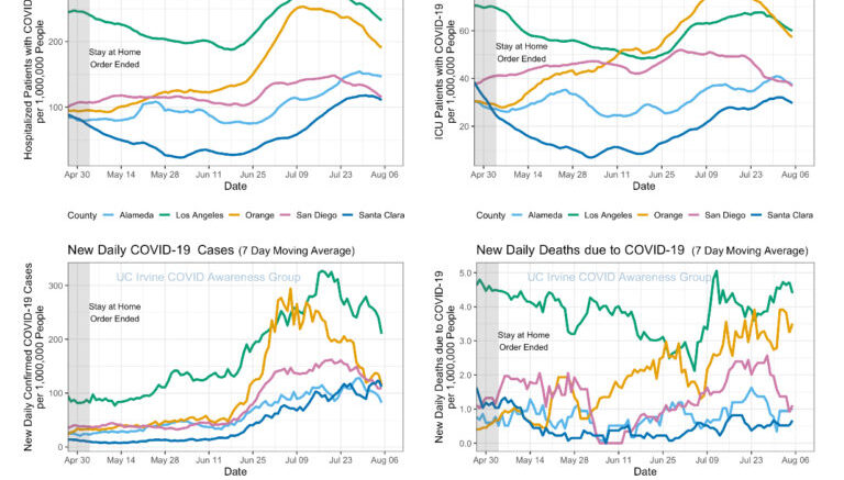
The site displays information collected from the California Open Data Portal in an easily comprehended format, giving visitors quick access to the most relevant data on hospitalized patients with COVID-19, intensive care unit patients, new daily cases and new daily deaths caused by the disease. It also offers color-coded Orange County maps, produced by UCI assistant professor of public health Daniel Parker, that show spatial patterns of growth in the number of cases, the number of tests and the fractions of positive tests from March through July.
Charts on the homepage reveal how the pandemic is affecting Alameda, Los Angeles, Orange, San Diego and Santa Clara counties. According to the developers, this is the first website to provide county-to-county comparisons of key coronavirus statistics.
“There is no shortage of COVID-19-related data visualizations out in the world, but what has been lacking is a platform for easy visualization and comparison of trends in California’s counties,” said Vladimir Minin, a UCI professor of statistics who led the team responsible for designing and creating the site. “Every county reports its coronavirus stats, but useful knowledge can be gained by holding up the numbers against other counties and normalizing by population size, which is what we have done.”
He said that hospitalization data in Orange County had become “alarming” in recent weeks and that the situation was even more explicitly dire when compared to other similar population centers in California.
“For example, Southern California residents may think that Los Angeles County is still an outlier in terms of being affected by the coronavirus spread, but the displayed trends clearly show that L.A. and Orange counties recently have become much closer to each other in some of the COVID-19 metrics,” Minin said.
In the future, the website team plans to add testing tallies, which are not available from all counties but are reported by L.A. and O.C. They also intend to increase the county comparisons.
Minin noted that the numbers backing up the charts, graphs and maps are based on seven-day moving averages, updated daily, and that the site’s images and code are shared under the most permissive public domain licenses to facilitate free use by entities outside UCI.
“What we’re doing is really simple from a technological standpoint,” said collaborator Padhraic Smyth, UCI Chancellor’s Professor of computer science, “but we felt that it was important to provide this type of data to individuals and the public in general to help inform their decision-making.”
The resource was developed under the guidance of an ad hoc COVID-19 awareness group at UCI that comprises members from the Department of Statistics, the Program in Public Health, the Center for Virus Research and the Infectious Disease Science Initiative. The group members’ research is supported by the National Science Foundation and the National Institutes of Health.
The website was built and is being maintained by Damon Bayer, Isaac Goldstein and Rachel Longjohn, Ph.D. students in the Donald Bren School of Information & Computer Sciences’ Department of Statistics.
Source: University of California, Irvine
Be the first to comment on "Researchers Launch Unique Coronavirus Statistics Portal"