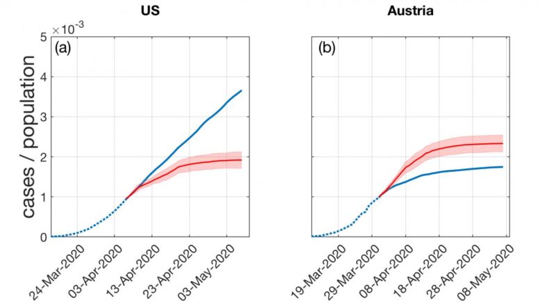
What if the U.S. would have introduced measures to reduce the average degree in contact networks from five to 2.5 people early on? This could have almost halved the number of COVID-19 infections until the first week of May. What if Austria would have implemented its strict measures against coronavirus spread 10 days later? According to the model, such a delay would have resulted in up to 30% more cases.Courtesy of CSH Vienna
With the first COVID-19 epidemic peak behind them, many countries explained the decrease of infection numbers through non-pharmaceutical interventions. Phrases like "social distancing" and "flatten the curve" have become part of common vocabulary. Yet some explanations fell short: How could one explain the linear rise of infection curves, which many countries display after the first peak, in contrast to the S-shaped curves, expected from epidemiological models?
In a new paper published in PNAS (Proceedings of the National Academy of Sciences of the United States of America), scientists at the Complexity Science Hub Vienna (CSH) are the first ones to offer an explanation for the linear growth of the infection curve.
"At the beginning of the pandemic, COVID-19 infection curves showed the expected exponential growth," says Stefan Thurner, CSH president and professor for Science of Complex Systems at the Medical University of Vienna. This can be well explained by a so-called snowball effect: An infected person would infect a few others, and in a chain reaction, those would pass the virus on to a few others as well. "With measures like social distancing, governments tried to push the growth rate below the recovery rate and therefore massively reduce the number of new infections. In this logic, however, individuals would have infected less than one other person, and the curve would have flattened, eventually reaching zero - something that did not happen," explains Thurner.
"What we saw instead was a constant level of infections with a similar number of new infections every day," adds co-author Peter Klimek of CSH & Medical Univ of Vienna. "To explain this with standard epidemiological models would basically be impossible."
The use of traditional epidemiological models would have required a lot of fine-tuning of parameters, making the model increasingly implausible. "If you want to balance measurements so that the effective reproduction number R stays exactly at 1 - something that would explain the linear growth -, you would have to reduce contacts by the same exact and constant percentage. In reality that is extremely unlikely," says Klimek.
In fact, the probability to observe linear growth in these standard compartmental models is practically zero, the CSH scientists point out. They were therefore inspired to extend the model and look for further explanations.
The complexity scientists explained the linear shape of the curves through a different form of spreading than initially expected: They assumed that the spreading dynamic continued in small and limited clusters. "Most people went to work, got infected and spread it to two or three people at home, and then those people went to work or school again. The infection was basically spreading from cluster to cluster," says Thurner. "The change of the infection curves from being S-shaped to a linear behavior is clearly a network effect - a dynamic very different from big superspreading events."
The scientists showed that there is a critical number of contacts, which they call degree of contact networks or Dc, below which linear growth and low infection prevalence must occur. They found Dc to equal 7.2, assuming that people circulate in a coronavirus-relevant network of about five people, which is even lower during an effective lockdown (household-size 2.5 people on average).
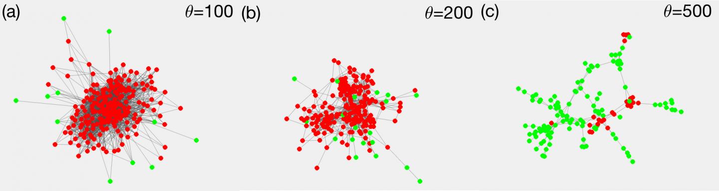
Contact network of employees in an office building in France, thresholded according to the number of contacts. In (a) all links are shown that connect two persons with more than 100 encounters, (b) and (c) show the cases for 200 and 500 encounters. In the densest network (a) almost all employees get infected (red). Only a few with weak ties to the network's core stay healthy (green). The same is true for the less dense network (b). Below a certain link density, things change abruptly (c): only a few infection clusters appear, while the majority remains healthy. This is the typical pattern observed in the COVID-19 pandemic when implementing social distancing measures. That shows the importance of reducing the network density below the critical point. The proof of the existence of such a critical point is the main contribution of the paper. The practical message is: Non pharmaceutical interventions should be able to bring social network density below that point. Courtesy of CSH Vienna
Instead of having to fine-tune parameters, their model allows for a wide range of possibilities that keep the infection curves linear. It explains why linear infection curves appear in so many countries, irrespective of the magnitude of the imposed non-pharmaceutical interventions.
In a further step the scientists compared Austria, a country which responded with a severe lockdown early on, and the United States, which initially did not impose severe measures. According to Peter Klimek, their model works for both scenarios: "Both types of countries showed linear curves, but in the case of the US and other countries like Sweden, these just happened on a much higher level."
The model not only explains the emergence of a linear growth regime, but also explains why the epidemic could halt below the levels of herd immunity by consequent social distancing. For the standard modelling procedure, the complexity scientists use a so-called compartmental model with SIR-models, extending it with the described cluster transmission.
But what will happen in the next months, with the potential of numbers rising again? With additional risk factors like people returning from vacation in other countries and more time spent inside, the spread of disease could change. "If infections rise again, there is the potential that linear curves turn to exponential growth again - something people described as a second wave," Klimek concludes.
Reference: Stefan Thurner, Peter Klimek, Rudolf Hanel, A network-based explanation of why most COVID-19 infection curves are linear, PNAS Aug 24, 2020 https://doi.org/10.1073/pnas.2010398117
Source: Complexity Science Hub Vienna (CSH)
138436 524262You ought to join in a contest for starters with the highest quality blogs online. I will recommend this page! 955871